Hole in the Dyke

Hole in the Dyke - Work

Port of Amsterdam

New corporate identity

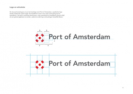
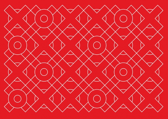
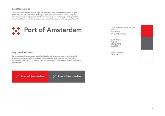
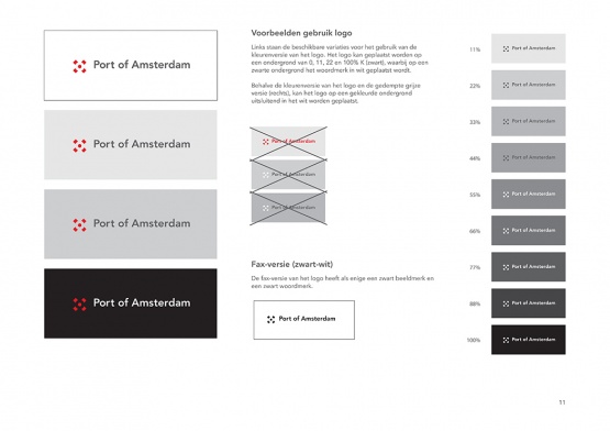
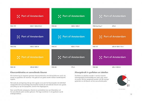
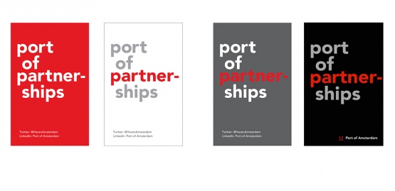
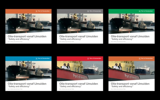
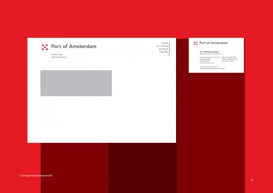
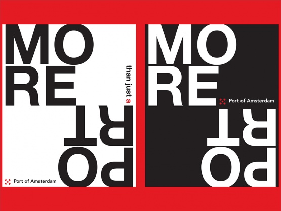
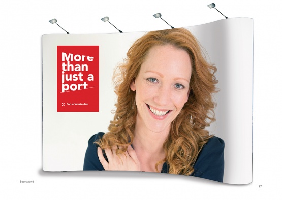
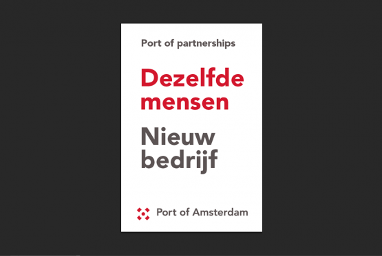
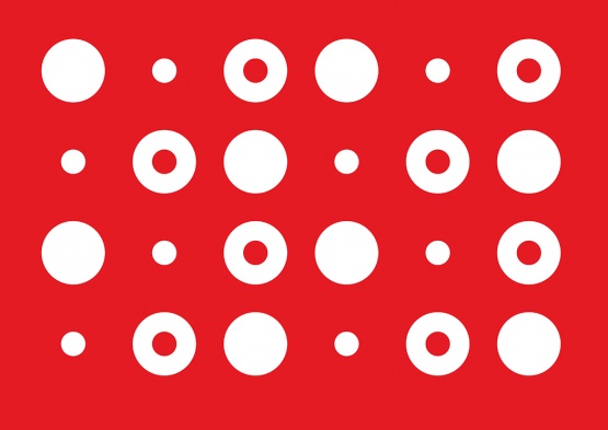
New identity for the corporatized Port of Amsterdam. The logo for the new Port Company is based on two forms - the circle and the (Andreas) Cross. The eye is 'forced' to see the form of the circle which is actually not there. The logo reflects the contrast between new and well-known; between open and closed; between looking inwards or looking outwards.

http://www.holeinthedyke.com/images/hitd-work/voorproefje-1050.jpg
http://www.holeinthedyke.com/images/hitd-work/POA-contouren-logo1.jpg
http://www.holeinthedyke.com/images/hitd-work/POA-contouren-pattern3.jpg
http://www.holeinthedyke.com/images/hitd-work/POA-contouren-logo2.jpg
http://www.holeinthedyke.com/images/hitd-work/POA-contouren-logo5.jpg
http://www.holeinthedyke.com/images/hitd-work/POA-contouren-logo6.jpg
http://www.holeinthedyke.com/images/hitd-work/Toyota_Yaris_Hybrid-1050.jpg
http://www.holeinthedyke.com/images/hitd-work/PA1-voorbeeld-1050.jpg
http://www.holeinthedyke.com/images/hitd-work/visite-3-1050.jpg
http://www.holeinthedyke.com/images/hitd-work/powerpoint.jpg
http://www.holeinthedyke.com/images/hitd-work/POA-contouren-kaartje.jpg
http://www.holeinthedyke.com/images/hitd-work/POA-positionering-1050.jpg
http://www.holeinthedyke.com/images/hitd-work/POA-contouren-standwand-1050.jpg
http://www.holeinthedyke.com/images/hitd-work/nieuw_bedrijf-1050.png
http://www.holeinthedyke.com/images/hitd-work/POA-contouren-pattern2.jpg